Thursday 12 May 2011

Fantastic Fredrick Walking (and creepy face)

This is my characters walk cycle and some of the expressions he can do. This is the first bit of my animation. I'll post up the evaluation I wrote for this project.


The process of creating this animation went very smoothly. The animation includes expression and a walk cycle. The idea is to show the characters personality and who he is through this. I think I achieved showing that my character is a wizard that likes beer. This is showed as the character walks hastily and smiles and it turns out it’s a massive beer he has been walking so purposefully towards.
Taking my research into account, I should have spent more time on texturing the model. Maybe looking into other techniques to do this. This is something I could work on in my next project. The characters in the animations I researched where often an extension of their surroundings. I think that with a stage for your character you can get a lot more personality across to the viewer.
As I worked through there were some obvious changes in my character design. This was due to personal and peer taste being talked over during the entire modelling process. This actually works like an extended group crit. I think a more in depth group crit would be very helpful to do at the beginning of the modelling process as this will give a direction rather than little additions being implemented and changed as I went.
The presentation was a bit like this as it brought up some issues with how my character was going to work and also some issues with the proportions. All of this was taken into consideration and the proportions where fixed.
If I was to do this again I would look at the types of shaders I could have done some test renders with. This would have added some stylisation to the  animation. The reason I would do this is because the research showed animations using different shaders to make their models look 2D or like a cartoon. This is what was done in the code hunters short.
Overall I am pleased with the outcome. I have achieved all my goals learning modelling and rigging techniques as well as morph tags and some new rendering and editing skills. An issue I have with my animation would be the camera shot. I tried to make it look like someone was walking next to my character filming by moving the camera around but this didn’t works as hoped. Also when the camera turns to his face view the key frames are very close and it looks like a jump shot rather than a swooping motion I wanted.

Wednesday 11 May 2011

Fiddler on the animation


I have edited the colours since designing the character and changed the hat almost completely to get rid of the mask that would cover my models lovely (Slightly creepy) face. 

Tuesday 10 May 2011

The Time Line (and the application of number to explain things)

This is how key frame spacing is important and effects an animation. It the frames are close together then the motion will be fast and if the key frames are apart the motion will be slow. The idea is to find the right speed. This can be done as a calculation although it is instinctive after a while. 


If a animation is set at 30 frames per second then 30 frames will be showed every second. This means a key frame set at frame 0 to a key frame at frame 30 will take exactly 1 second.

Here are some formulae I use in my head to quickly determine the optimal frames per second and the spacing required.

To determine animation length. AL = Frames/Fps
To determine frame rate this can be used backwards. Fps= AL x Frames

To work out how long a motion will take. You first work out the timing in seconds. This can be done mentally or you can act out the motion and count for an estimate. Then use this estimated motion time to times it by the frames per second. So a motion of waving takes 3 seconds. If the animation is set to run at 24 frames per second then you will need that motion to be set between 72 frames. 
Frames needed for motion = Time taken for motion x Frames per second.
Example in formula: 3s x 24fps = 72 frames

These are all being used all the time when animating. The computer actually helps a lot with this using time lines and real time previews for trial and error.

Monday 9 May 2011

E4 Morning

Boats


On this post I am going to look at the Strength, weaknesses, opportunity and threats to my work in relation to this animation. This will be a SWOT analysis and I will then produce SMART targets based from this.

Strengths
With this animation I think it's my pure skill and wit that carries the idea and this is recognized by the viewer. I think the actual work on the composite works well.
Weakness
The ammont of detail is low. The image quality was lost twice due to importing the same file into other programs and not setting the resolution correctly.
Opportunity
This gave me the opportunity to enter E4's Esting competition. As well as a chance to use compositing in cinema 4D as well as experiment with camera tracking software.
Threats
The threats I have noticed is mainly my weakness in quality control may be the reason I would not win a competition like the E sting one.

SMARTs
(Little achievable targets for everyone to enjoy)
...should really call them latfetes then. but some SMARTy pants came up with something else.

My aims are to:

1. Work on setting up my renders and exports properly.
2. Get the software at home and practice.
3. Make another E4 sting that looks better.

Battle Ships Test

This is a test for my battle ships. This is just the movement and smoke effect test. The real one has the same model but the smoke is not 3D and the water is actual footage.

Some of the 2.5D Animation


This 'animation' is a black comedy about the impact of of artificial fertilizers being used on farms. The farmers are used to these creatures as this is what has become of the super bugs that have evolved to resist the chemicals resulting in great size. THIS IS A REALITY!

Photoshop - Colours

These are some screenshots from colouring up some stuff in photoshop. These are actually taken from my animatic. I would upload the animatic but it's no longer on my memory stick.


The Baby Falling

This is a loop I did for my first project. This was created in flash. I made just one loop and then used the loop as a symbol to make the rest happen. It's not very long and the quality but... it moves.


This is not the best animation I have done... The art style is very cartoony and looks like an average rubbish flash animation.
Things I could take away from this:
  - Timing
The background is very jumpy. This is because I used to many key frames. If I had made a tween between two points and lined the first frame up with the last this would have flowed just fine. It's every second the background snaps back to where it was which creates the jerky effect. This is because the frame rate is 24 frames per second and the loop is 24 frames. This means thats exactly a second between jumps.

  - The use of cycles
Cycles are a good way to re use elements of an animation and they help speed up production times and cost.


Sunday 8 May 2011

Pictoplasma! 2011!

I loved it! The artists all had very interesting things to say and it opened my eyes to a world of design that I actually thought was a lot smaller.
Each gallery had different styles and ideas of ways to present an idea.
Here are some examples of some things we saw:
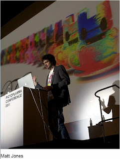
Matt jones was a model maker. I had no interest in this before seeing him talk. He spoke about how he had an idea and that he just did it. That's a good thing to take away from his tales. I liked his character design and the way he had other artists use his model to create new models of their own. Some of these where very weird. We went to his 'kitchen' and saw all the models and some more of his work laid out on the tables.

Ryan Quincy is the animation guy at south park. He was at pictoplasma with his new animation which he had based the main character on himself. This was a very good talk and it was quite funny and interesting to she his process.

Takahashi actually creates his art and implements them into a game. His games are quite different from other games. This is something I was very interested in and would love doing one day but the talk was a little hard to understand and went on for a very long time.


These guys are representing the final show. It was like... bad... But then this awesome piano guy came out and things started looking up.

Monday 21 March 2011

What am I doing

This week i have planned to finnish my 3D model.

Monday: I will update my blog then get to work making the hands for my model. I might need to make them and then attach them to the rest of the model.
Tuesday: This day will be dedicated to modeling the head of my character. I need to model a hat also and still need to work out how I will fit a mask/hat over a 3D head.
Wednesday: Textures. I will find/photograph and create textures for each part of my model. I'm not looking to be 100% realistic there should be an element of cartoon.
Thursday: Add all the textures. And edits.

Monday 28 February 2011

Week Plan 5

Monday
Tuesday
Wednesday
Thursday
Friday
Update the blog.  Listen to Paul. Then start a full render of the E4 In the morning sting. Then get the rest of the battleships animated. Take screen shots and save them to memory stick.
Render battleships. And work on evaluation and testing. I also have to put the render into final cut and add the sound.
Gather/buy folders for all project work ready for hand in. Make the discs with all the data on. Plan a list of things to do that need complete for hand in.
Finish off everything that I list on Wednesday.
Hand in!

Week plan 4 review


Monday
Tuesday
Wednesday
Thursday
Friday
I looked at using illustrator and talked about layout and the background. I had a good idea of a magic scroll and it would be good to see what it looks like when made in 3D
Boats are now in the footage and move. Need to animate the fight. They plugs need to fall and smash stuff up.
Made the boats move and fire but there is no reaction as of yet and the plug aren’t animated to fall and destroy.
Didn’t get rendered but got another animation done in cinema 4D by using a tutorial and the idea of breakfast time eating excitement.
Crit the breakfast animation and made some improvements.

Monday 21 February 2011

Week Plan 4


Monday
Tuesday
Wednesday
Thursday
Friday
Looking at using illustrator and looking at layout techniques for some character sheets.
Get the boats working with the footage. Make any alterations.
Animate. Make the boats move and fire and sink…
Render. Look at what I can do to enhance the animation.

Time Plan 3 Review


Monday
Tuesday
Wednesday
Thursday
Friday
Characters are pat done in illustrator. Didn’t get the research done fully but ill do more later.
Got some ships made. 2 and the carrier.
I didn’t look at sounds. Instead I have recorded some footage of the river to put my animated boats into.
Did CAD all day.


Monday 14 February 2011

Week 3


Monday
Tuesday
Wednesday
Thursday
Friday
Character design in illustrator.  Cinema 4D.
Looking into Gaston cabba, aron martin, fonz Sheldon,
Tado, friends with you.
3 battleships made in cinema 4D. Also need the aircraft carrier and pin built.
Sound, look at sounds and recording the tracks. This can them be used for timing the animation.


What's went on... Volume 2

Monday
Tuesday
Wednesday
Thursday
Friday
I finished of the proposal. Updating my blog with a few more idents and animations didn't happen but I did a little design work. Updated my time plan. The Illustrator workshop went well.
Created my presentation from my proposal work and practiced (Well I read through it. Didn't get story boards coloured.
Presented. Slowly...
Spent the day trying to get battleships built in C4D. Got some development done but encountered some Issues. I think these will be easy to over come by learning some new techniques and doing some tutorials.
Other project work. Characters.

Wednesday 9 February 2011

Presentation Write Up

Presentation didn't go that well. The idea is like someone else's idea using 3D battleships. The idea of pop art 2D characters was scrapped as well. I'm not going to fall into the same old trap I have done countless times and start out on an idea when I know I'm going to dread every moment of animating a poor story with bad ideas and designs. I would end up just not finishing which results in a fail. I'm putting battleships on the bench and calling out the same old animation everyone else does... At least it might then be liked for once. If I don't have a solid idea taking into account the feed back from the presentation I'll fall back on the battleships and use footage of the sea with 3d boats. Thinking about a way to bring the characters (that are not important)in to tell the story... Maybe I'll look at cute child like themes. The new idea and concept should have a twist. Something the user isn't expecting... I'll get to work and maybe get a simple outline animatic made up showing the idea.

Monday 7 February 2011

Week 2 Plan


Monday
Tuesday
Wednesday
Thursday
Friday
Finish the proposal. Update blog with a few more idents and animations. Update time plan. Illustrator workshop.
Presentation work and practice. Maybe get story boards coloured if there is time.
Present.
Mega Mystery day! Anything could happen! But I think I’ll start working towards animatic maybe made in flash quick.
 Look over past weeks work and reflect.


This week is a bit of a strange one with a presentation to prepare for and do. I also expect to be doing some workshops on programs thursday so that might be something to look forward to and might interfere or might help my plans.

What's went on


Monday
Tuesday
Wednesday
Thursday
Friday
Went well, I got most of the tasks complete. Some of the research was completed later on in the week. I was uploading as I went most of the time.
Research went well. Was mainly the same kind of stuff as the day before.
Change of plan. Made 3 storyboards in rough. Worked on some art work/styles.
Change of plan. We developed characters and did some 3D modeling practice.
The proposal need to be finished and turned into a presentation. This will be the start of next weeks table.

Thursday 3 February 2011


This is pop art. Looking into this as a style for the battleships idea! This could look amazing as 2.5 D Cut out.

Wednesday 2 February 2011

Penguins Jumping - I like it


These are some videos of some penguins jumping. When watching some animal show the other day I found myself laughing at the action of a penguin jumping. I don't know what it is but the way they prepare for the smallest of jumps is amazing. It's the exact same wether its a few inches or a few feet. Hope you enjoy them.

I'm not just going mad posting penguin videos. I want to use this as a possible ident idea.

Little Horrors By adamcadwell


Another Esting entry from 2009. Little Horrors by adamcadwell

I really like the look of the characters with just the right amount of detail used in each. The animation however is jerky and doesn't look right. I think this is because its jumping pose to pose with no tween frames to add some flow to the movement.

The idea is alright having scary things being scared of the logo. That is as deep as I can see this going. The reveal is well timed though. The way the camera and characters are in the last scene is very appealing with the characters in almost silhouette bringing attention to the E4.

The backing sound is just the boring 4 music but I guess this keeps the idea of E4 in the whole sting not just the end. The sound of the characters is suitable but doesn't change much between creatures.

Things I'll take from this:

  • The art style is appealing.
  • The reveal is a nice way to present the logo.
  • Sound could keep the E4 theme before the reveal but this isn't fun.

LCD By Grace Panda


This is LCD an entry for the E4 Estings by Grace Panda.

The Idea seem to be to present the E4 logo in the style of a retro gaming system. There is no real story but the idea is to scroll from console to consoles sometime over lapping the graphics shown within the consoles screens.

The idea of an animation inside an animation is really clever. The viewer has a lot to look at with lots of graphics showing all over the place. Lots of the animation is true to the consoles movement which was limited due to it having an LCD screen. They had added colour though. The E4 logo is obviously present most of the time which is the idea of a sting.

The graphics are inspired by the characters and games that were on watch and game systems. This is also the source of the sounds as I recognize lots of the sound effects. They have been remixed together though. I like that the music has attention drawn to it by the monkey playing drums at the start of the animation. Drawing attention to the sound design can make an animation seem more exciting and makes it snappy.

Things to note:

  • The animation has a solid theme instead of any real story.
  • The logo is always on screen.
  • The colours used are E4 colours and fit in well.
  • The music is in-keeping with the theme.

Five USA - Idents 2009


These are the idents used for fives USA channel. http://www.theidentgallery.com/player.php?id=FIVEUSA-2009-ID-2 and http://www.theidentgallery.com/player.php?id=FIVEUSA-2009-ID-3

The idea behind these Idents seems to be showing US culture. This is done by showing lots of little clips from US activities. They then link this to the channel by putting FIVEUSA right over the clips.

Obviously this is filmed but I can still learn something from it. The branding is important. You can be pretty harsh with sticking it in the users face. I personally don't like this approach but now I think about it there is something very american about loudness and being in your face. So this is quite fitting.

The images sometimes link together but other times they seem to cut away at random. They don't link up to the sound in the slightest and the sound isn't to loud so can be talked over.


Tuesday 1 February 2011

BBC Three - 2009 Ident


This is a BBC three Ident from 2009. - http://www.theidentgallery.com/player.php?id=BBC3-2008-STING-4

The structure of this ident is the growth of the flowers maybe meaning the growth of the channel. The kissing couple maybe with the meaning of love or coming together. The last thing is the three tubes filling up with the gloopy stuff three went with as their recurring theme that year. This could show progression or loading or waiting which could be about waiting for the next show to start.

The action of the motion starts slow with a big happy ending with full colourful flowers, the couple kissing and the three being full. The music changes to a happy guitar riff instead of the strange sound you hear to start with.

The colours used are darker gloom colours that almost gradient into to happy, bright colours that draw the focus of the viewer towards the center and the bbc three logo. I expect this was the intention. The sky is a dramatic setting with great detail. The plants are fantasy plants but with obvious real life inspiration.

The sound is a gloomy mess of sound that when the kiss loading of the gloopyness and the flowers are grown changes to a happy guitar sound. The sound was most likely post synchronous as the motion doesn't really follow the sound. It could also be non synchronous.

The animation is made in a 3d program like maya or cinima 4d. The textures were most likely made in photoshop. The shot is just one long shot of the same scene. The three may have been added later using a program like after effects or final cut pro.

The audiance could be anyone but mainly young people entering adult hood. The coming together and the waiting and the growing all suit this and its bbc threes audiance so it all works out fine!

So what information can i take from this babble and in what way can I use it?

  • Fit the audiance.
  • Be metaphorical.
  • Have clear graphics.
  • Pull the user into the main point. In this case its the logo for the TV program.

Dizzy Dave By Albinal


This is an Esting runner up from 2009. Dizzy Dave by Albinal.
The style of the animation is clean and natural looking. This is appealing to the audience. The sound works perfectly supporting each action. The idea is solid. It has a good narrative for 10 seconds with a full start, middle and end. The idea is that the character can only see E4 by getting the dizziness before he passes out. This is a nice way to demonstrate how amazing E4 is. The build up of suspense and the setting of the scene for the action is good and impressive to get into 10 seconds. Using one shot works for this as cutting to other shots makes the animation seem quick as the viewer is jumped from place to place which could be messy.
Things to take note of:

  • Trying to get a full story into the animation works.
  • Looking neutral with no clashing colours works well. Maybe having E4 clashing.
  • Sound working with the motion is very effective.
  • Hidden little story is always a nice touch.

E Speaker - By robboranx


This is an Esting entry from 2009 by user robboranx.
I don't like the visual style or the animation but I do like that the graphic moves with the beat of the music. This is what I'm looking at not the way it's done but what it's trying to do. My sting could work with the music. This could be in the form of a walking speed or with a band playing along. This is something I'll look at when developing ideas.
The animation doesn't have a punch line which I think good stings have to have. Simply showing the logo up close doesn't put an end to the animation. Especially as the beats still beating but the speaker has stopped moving to give a view of the logo.

Things to think about:

  • Having a punchy ending.
  • Maybe having music or sound working with the animation motion wise.
  • Don't have one motion for the entire animation.

Weeks Time Plan

I should be uploading a time plan every week from now on. This is to make sure I have a plan...

Monday
Tuesday
Wednesday
Thursday
Friday
-Produce a detailed time plan for the first week.
-Research idents finding relative examples to support an idea for an E4 sting.
-Write about 5 of these.
-Upload action plan and research to my blog.
Research what makes an ident successful, how others have approached creating idents and their visual styles.
Create a proposal of my 3 ideas following the guidelines.
Produce a presentation that can be presented to the class.
Start storyboards getting 3 intial storyboards created considering camera shots and narrative/visuals.
Create a high quality visual of one image from the storyboards to set the look I’m trying to realize.
Reflect on what has and hasn’t been completed as planned and complete anything that is not finished.

New Blog - Fresh Start

Welcome to my blog! This is my new blog as my old blog wasn't working for me. I had done very little work on it and it made me sad. Also I forgot the email address the blog was linked to as well as the blog name and password...

I will do a repost of the animations I have created at college up till now but I hate them. They are the worst things I have ever seen and I don't know why they were even made.... I didn't even like the idea to start with.

Things I'll be posting from now on:

  • Things that look amazing!
  • Things that make me think... 
  • Things I did myself that come out of my head and that.
  • Evaluations and things.
  • Stuff I'm told would be a good idea to post for college.

This is the end of this post.
 Hope you enjoy my blog and visit every so often to see if I have any new things to look at.

   Thanks

         Bye!